The Golden Triangle is Dead. Your Menu Doesn't Know Yet.
There is a study sitting in a 2025 Texas A&M research archive that quietly invalidates about forty years of restaurant design doctrine. It does not announce itself. It does not come with a press release. It is simply a collection of eye-tracking data from guests interacting with digital menus - and what it shows is that almost everything the industry believed about how people read a menu is wrong.
Not outdated. Not partially correct. Wrong.
The Golden Triangle - the idea that a guest's gaze naturally gravitates toward the centre of a menu, then sweeps to the top-right and top-left corners, forming a triangle of premium visual real estate - was built on observations of print menus.
Laminated, two-panel, handed across a table under ambient lighting. That was the world it described. That world still exists in some venues. But it is no longer the dominant context in which guests interact with a menu, and it has not been for several years.
The eye-tracking data from the Texas A&M study does not show a triangle. It shows a line. Guests reading digital menus read top to bottom, left to right, in sequential order - the same way they read everything else on a screen. The same pattern that governs how they move through a news feed, a product page, an inbox. The visual habit trained by a decade of smartphone use does not switch off when they open a restaurant app or a QR-linked menu. It applies.
The implication is not subtle.
If the Golden Triangle was the map by which an entire generation of operators decided which items to feature, which dishes to promote, and where to park the margins that kept the business alive - and that map was drawn for a surface that most guests no longer use - then what has been happening to all that careful placement? All those "prime position" decisions? The specials engineered into the upper-right panel?
They have been going unread. Or read last, after the guest has already formed an impression from whatever sat at the top of the digital list.
This is not a design problem. It is a revenue problem that has been misclassified as a design problem, which is why it has persisted.
What Sequential Scanning Actually Does
When a guest opens a digital menu, they begin at the first item in the first category and move downward.
This is not conscious. It is the default scanning behaviour that backlit screens have trained into the human visual system at scale. The guest is not looking for a map. They are reading a document.
The practical consequence is that the first two slots in any category receive a disproportionate share of attention. The item in position one is seen by nearly every guest who opens that category. The item in position seven - on a mobile screen, below the fold, requiring a scroll - might as well not exist for a significant portion of those same guests.
The BBQ operator in Texas who moved turkey above brisket did not intend to conduct an experiment in sequential scanning bias. They were solving a different problem and the placement changed as a side effect. But the outcome was measurable and immediate: turkey ordered more frequently, brisket still ordered, and the overall category margin improved. Not because the items changed. Because the order of encounter changed.
This is the mechanism. And once it is visible, it becomes impossible to look at a digital menu the same way.
The highest-margin item buried in position four of a six-item category is not being overlooked because guests don't want it. It is being overlooked because it is asking guests to keep reading past the point where their attention has already started to decay. The friction is invisible. The cost is not.
The Comprehensiveness Trap
Alongside the Golden Triangle, the industry inherited another doctrine: that a comprehensive menu signals quality, choice, and capability. That a 100-item menu communicates abundance. That guests want options.
What the research community calls "choice overload" and what operators experience as "the table that can't decide" are the same phenomenon at different scales. Beyond a threshold - and the data points toward approximately 35 items as a functional ceiling for digital menus - additional options do not expand perceived value. They create cognitive friction. The guest is no longer choosing; they are processing. The experience shifts from anticipation to work.
The guest who spends four minutes staring at a menu before ordering is not excited.
They are exhausted. And an exhausted guest defaults to the familiar, the safe, and the cheap.
They order what they recognise, not what they might enjoy. The kitchen's most interesting, highest-margin items - the ones that took the most development, the ones that carry the best contribution - are exactly the ones that an overwhelmed guest is least likely to reach.
A curated menu of 35 items does not tell the guest there is less to eat. It tells the guest's cognitive system that a decision is achievable. The time-to-order shrinks. The table turns with less friction. The kitchen, working from a reduced complexity set, executes with higher consistency on fewer moving parts.
This is not a theory about simplicity. It is an observation about what happens to decision quality when the number of decisions required exceeds cognitive capacity.
The Hidden Cost That Does Not Appear in the P&L
There is a line item that does not exist in most restaurant reporting: the cost of misallocated visual hierarchy.
When a high-margin item - what traditional menu engineering would call a Star or a Puzzle - is placed below position two in a digital category, the revenue it might have generated is not lost in a way that shows up anywhere.
It simply never arrives.
The guest who would have ordered it was never shown it at the right moment. The contribution that item could have made is invisible because the counterfactual never happened.
This is why the problem persists. No one is reporting on the revenue that sequential scanning failed to deliver. The sales from position-one items look normal. The sales from position-four items also look normal, relative to themselves. The analysis never asks: what would have happened if these two items switched places?
The operators who have run this experiment - who have audited their digital menus against actual margin data and restructured the visual hierarchy accordingly - consistently report that the shift does not require new dishes, new pricing, or new marketing. It requires different placement.
The same kitchen, the same menu, the same guests - and a material improvement in average contribution because the highest-margin items are now the first things those guests encounter.
The Apex Position principle names this mechanism: the first two slots in every digital category should be occupied by the highest-margin Stars or the highest-potential Puzzles.
Not the most popular items.
Not the items the chef is proudest of.
The items whose contribution, multiplied across the volume of orders in that category, produces the best financial outcome for the business.
The Pain of Paying
There is a second mechanism operating alongside visual hierarchy that the industry has been even slower to absorb.
Pricing psychology research has established that the visual presence of currency symbols - the dollar sign, the decimal, the cents notation - activates a mild but measurable pain response in the brain. The guest processing "$14.50" is, at a neurological level, experiencing something subtly different from the guest processing "14." The first is being reminded they are spending. The second is being shown a number.
The difference in outcome is not trivial.
Studies examining menus that removed currency symbols and decimal points found check average increases of over 8%. Not because prices changed. Because the psychological friction of the transaction was reduced.
This is not a manipulation. The guest is paying the same amount. They are simply less focused on the act of paying, and more focused on the act of choosing what they want.
For an operator running on 3-5% net margin, an 8% lift in average check is not a footnote. It is the difference between a business that is fragile and a business that has room.
And yet most digital menus still display prices in the format inherited from print menus, because no one has interrogated why.
The Menu as Interface
What emerges from the Texas A&M data, from the pricing psychology research, from the choice architecture literature, is a reframing of what a menu actually is.
A print menu is a document. It is designed once, printed in quantity, and distributed. Its constraints are physical. Its design logic is static.
A digital menu is software. It can be updated in real time. It is not a static object delivered to a guest; it is an interface through which a guest makes a decision, and that interface can be engineered.
The operators still thinking about their digital menu as a PDF they upload to a QR code are not wrong about what they have. They are wrong about what it could be. The leap from "menu as document" to "menu as interface" is not technical.
Most of the platforms already support the functionality. The barrier is conceptual - the inherited belief that the menu's job is to list what is available, rather than to architect the order in which a guest encounters what is available, and to reduce every source of friction between that guest and a decision.
The menu is the first moment of conversion in the service experience. It is also, for many digital-first operations, the moment of highest abandonment. The guest who closes the menu without ordering, or who defaults to a safe familiar item when the real margin opportunity was three scrolls down, is not failing to engage. The interface is failing to guide.
What This Means in Practice
The shift does not require a menu redesign. It requires a menu audit.
The questions are operational and specific:
Which items in each category carry the highest contribution?
Where do those items currently sit in the visual sequence?
What is the gap between their placement and the Apex Position?
What is the current price display format?
What would change if the decimal and currency symbol were removed?
These are not design questions. They are revenue questions that have been sitting inside a design problem, unasked, for years.
The Golden Triangle gave an entire generation of operators a map to a territory that has since shifted. The map was not useless - it described something real, for a surface that was real, at a time when it was the dominant context.
That time has passed.
What replaces it is not another “theory”. It is a set of mechanisms:
sequential scanning bias
cognitive load thresholds
the pain of paying
the Apex Position.
The question is not whether to engage with them.
The question is what has been lost, quietly, in the years since the menu moved to a screen and the design logic stayed on paper.
The Etymology of Welcome
Ever wonder how you know if you're a truly welcome guest?
The clues are in the meal. A hot, freshly cooked dinner signals warmth.
But if you're served "yesterday's leftovers" - like a cold shoulder of mutton - it's a sign you might not have been expected (or wanted!).
Worse still?
Being made to "eat humble pie." This phrase has a literal origin: the pie was made from the deer's umbles (innards or worst parts).
After a day of hunting, the rich would feast on venison, while their servants - those beneath the stairs - were relegated to the umble (and thus, humble) pie.
True hospitality often lies in the quality of what is shared, whether it's a meal or an opportunity, and the reciprocal respect between guest and host.

QUOTES FROM THE PASS
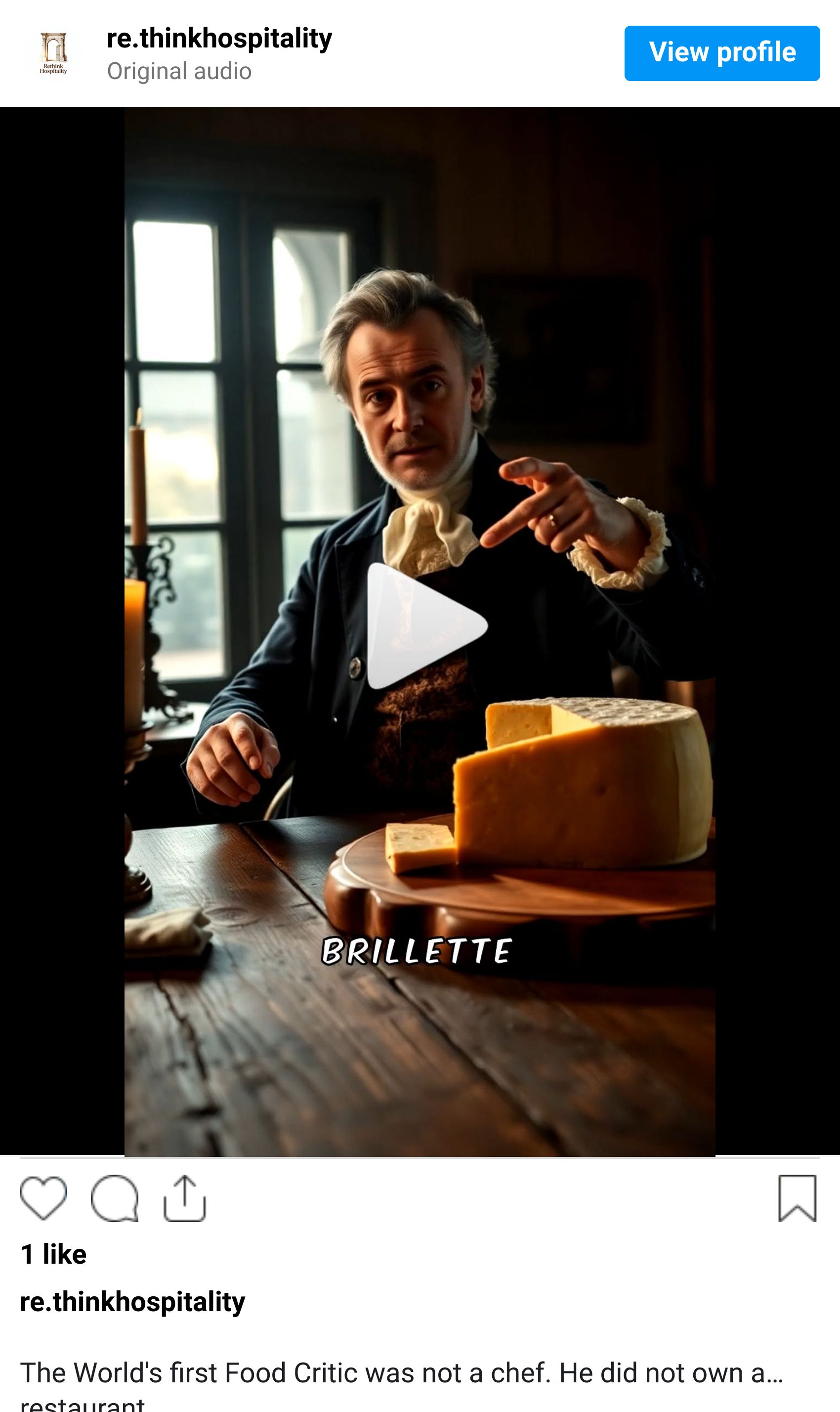
Tell me what you eat, and I will tell you what you are.
Until next time,

For more tips and deeper dives into hospitality success, follow me on LinkedIn or subscribe to the rethink newsletter. Subscribe